Built as a diary, the 365 watercolors reproduced in Written in Water represent the creative process of famed American architect Steven Holl. Holl's highly individual method of capturing in watercolors his initial ideas and sketches for all major buildings and competition projects was developed over many years. As an architect, Holl is known for the sculptural qualities he gives to structures and for his genuine use of light -- two qualities which are in tune with the characteristics of the watercolor technique. Among the increasingly high-tech working methods common to his profession, Steven Holl's reliance on a highly artistic and resolutely low-tech process becomes spectacular and inspiration.
Lars Müller Livres
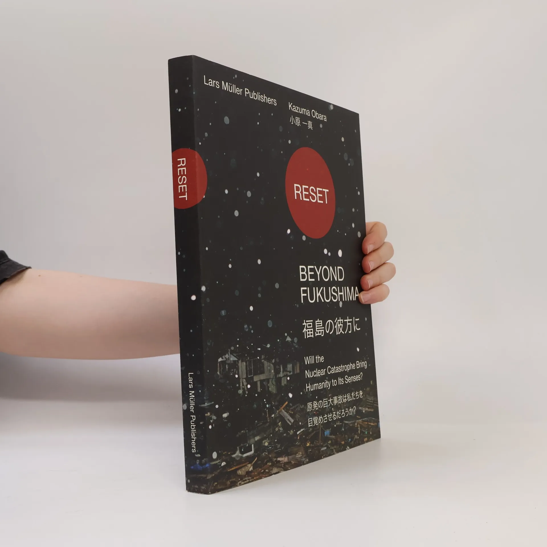

Reset. Beyond Fukushima
Will the Nuclear Catastrophe Bring Humanity to Its Senses?
- 216pages
- 8 heures de lecture
Wenige Tage nach den katastrophalen Ereignissen, die sich im März 2011 in Japan abgespielthaben, reiste der Fotojournalist Kazuma Obara in die betroffenen Gebiete. Er traf und porträtierte die Menschen vor Ort, besuchte das Kernkraftwerk Fukushima Daiichi und führteGespräche mit den Arbeitern der Anlage. Diese Interviews sowie die im Verlauf mehrerer Monate entstandenen Aufnahmen werden hier erstmals in Buchform veröffentlicht. Obaras Fotografien bieten bewegende Einblicke und zeigen die Folgen der Nuklearkatastrophe. Entstanden ist eine Dokumentation, die den Blick für eine längerfristige Betrachtung derEreignisse und für die Frage nach der Verantwortung öffnet. Sie hält in einer sehr sachlichenFotografie anhand konkreter Szenen fest, wie weitreichend die Folgen der Katastrophe sind: für die Menschen vor Ort, aber auch weltweit. Damit ermöglicht sie eine Betrachtungsweise, die über die konkreten Ereignisse hinausweist: Beyond Fukushima.
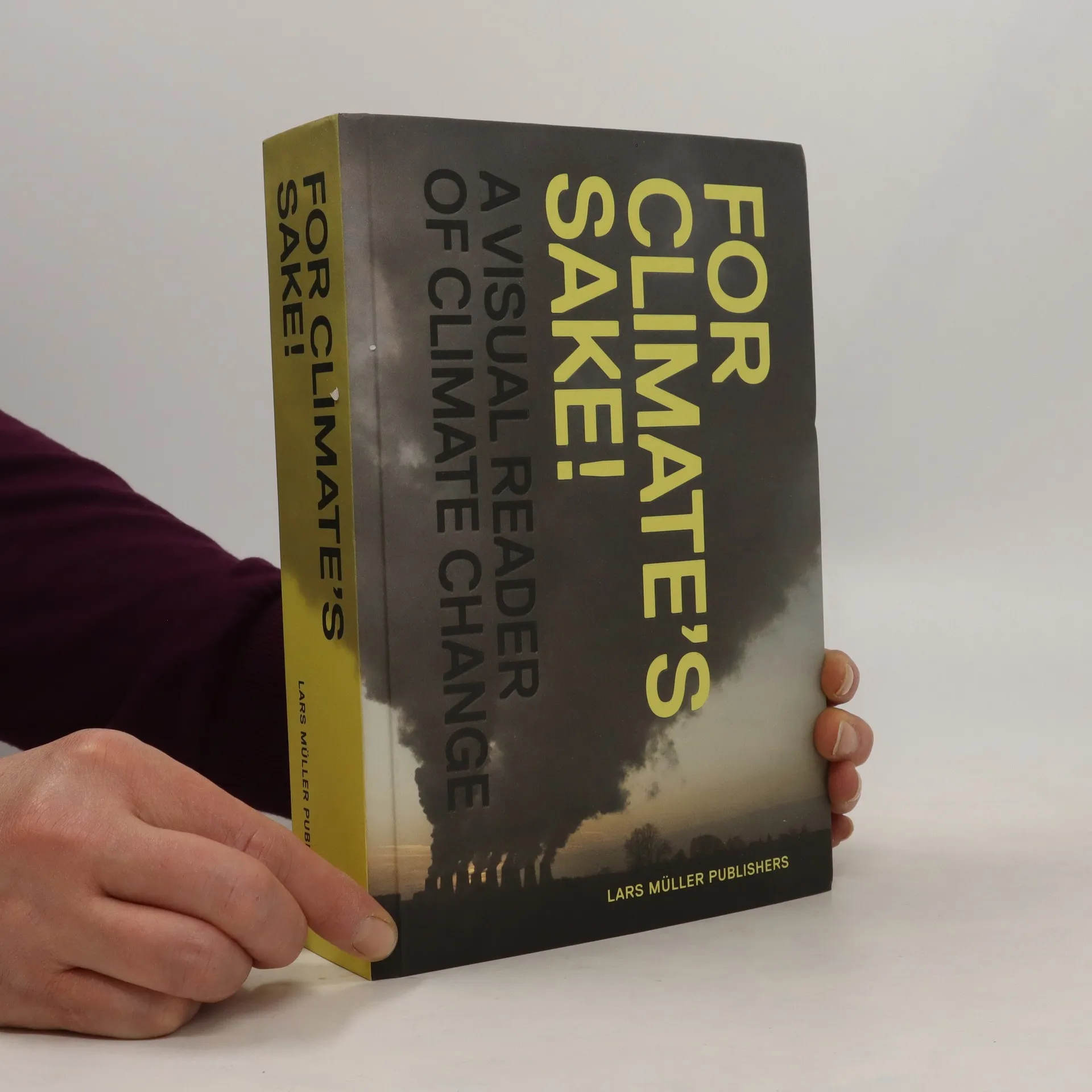
For Climate's Sake! investigates our planet's complex climate system and presents the most up-to-date findings of climate research in scientifically sound yet understandable language. It describes the intricate negotiations behind international attempts to find common ground in climate policy. Knowing the facts and their contexts is the prerequisite for awareness of the problems ahead and for shaping our opinions. This book offers the reader insight into Earth's climate history and identifies the factors responsible for climate change.
A new edition showing the work of one of the most famous Swiss designers: a comprehensive overview of his oeuvre.
Helvetica : homage to a typeface
- 200pages
- 7 heures de lecture
An ode to the beloved typeface Helvetica is a sans-serif typeface. It is simple and clean, and commonly seen in advertising, signage, and literature. The R has a curved leg, and the i and j have square dots. The Q has a straight angled tail, and the counterforms inside the O, Q, and C are oval. It is an all-purpose type design that can deliver practically any message clearly and efficiently. It is one of the most popular typefaces of all time. Homage to a Typeface presents 400 examples of Helvetica in action, selected from two diametrically opposed worlds. Superb applications by renowned designers are juxtaposed with an anonymous collection of ugly, ingenious, charming, and hair-raising samples of its use.
Ruth Erdt - The Gang
- 125pages
- 5 heures de lecture
Ruth Erdt addresses the so-called everyday matters of life. By un-selfconsciously directing her camera at her children, herself, and her partners, she lets the viewer in but operates in the field between authenticity and fiction. In restrained and peaceful images that hover on the threshhold of still normality and suspect action, Erdt tells stories about her life -- or what the viewer assumes to be her life.
Diskurse und Praktiken der Schulbuchproduktion in der Bundesrepublik Deutschland und England am Beis
- 560pages
- 20 heures de lecture
Das Buch beleuchtet den Prozess der Erstellung von Afrikawissen in Schulbüchern und analysiert die vielfältigen Einflüsse, die Schulbuchautor*innen dabei erfahren. Es untersucht die Interaktionen zwischen verschiedenen Akteur*innen und Praktiken, die das Wissen über Afrika prägen und reflektiert, wie gesellschaftliche Auseinandersetzungen um Schulbuchinhalte das Verständnis von Afrika in Bildungseinrichtungen beeinflussen.
Fisch und Meeresfrüchte verarbeiten, haltbarmachen und vermarkten
DAS Handbuch für Produzenten, Händler und Genießer
Dieses Buch bietet umfassende Anleitungen zum Schuppen, Entgräten und Filetieren von Fischen sowie zur richtigen Lagerung und Haltbarmachung. Es richtet sich an Fischliebhaber und Angler und behandelt auch die Vermarktung von frischem Fisch und Meeresfrüchten sowie deren Präsentation.
Kunstmuseum Liechtenstein
- 112pages
- 4 heures de lecture
Die Rolle nicht-internationaler Waffenstillstandsabkommen im humanitären Völkerrecht
- 266pages
- 10 heures de lecture
Das Werk öffnet dem allgemeinen und dem humanitären Völkerrecht den Blick auf das bisher kaum beachtete Rechtsinstrument der Abkommen aus nicht-internationalen bewaffneten Konflikten. Bestand und Geltungskraft des humanitären Völkerrechts innerhalb solcher Konflikte werden von staatlicher sowie von wissenschaftlicher Seite zunehmend in Frage gestellt und das Vertrauen in dieses Recht scheint allgemein zu sinken. Dem stellt das Buch eine Analyse nicht-internationaler Waffenstillstandsabkommen gegenüber, in denen die Konfliktparteien – Staaten sowie nicht-staatliche Akteure – selbst Recht setzen und dabei auch humanitäre Regeln vereinbaren. Das Buch arbeitet diese Praxis anhand von Abkommen aus Konfliktregionen Afrikas, Asiens, Lateinamerikas und Europas auf. Der Autor kommt so zu dem Schluss, dass sich auch aus einem positivistischen Blickwinkel hierin Völkerrecht erkennen lässt und gibt so der stagnierenden Diskussion um Inhalt und Legitimität des humanitären Völkerrechts einen neuen Anstoß.
Nix gegen dich
200 kleine Sticheleien für alle, die lieber einen guten Freund verlieren, als einen Scherz auszulassen
- 239pages
- 9 heures de lecture